The 2027 logo
Anything about this year’s carnival: posters, posts, tickets, t-shirts, the celebration's pages. Redrawn every year.
Potamia Carnival
Ready-made backdrops at the right sizes, the logo, and how to put them together so it looks like the carnival without knowing any design software.
The carnival of a village on Thassos, run by the villagers themselves — not by a council, not by a company.
Every winter the village's groups build floats and write satirical sketches — about current affairs and politics, about local Thassos affairs, sometimes about history or the twelve gods — and take to the square on the last Sunday of carnival. It is organised by the «Dionysos» cultural association. It is not staged for tourists: it is a village making fun of itself — but anyone who turns up is in it.
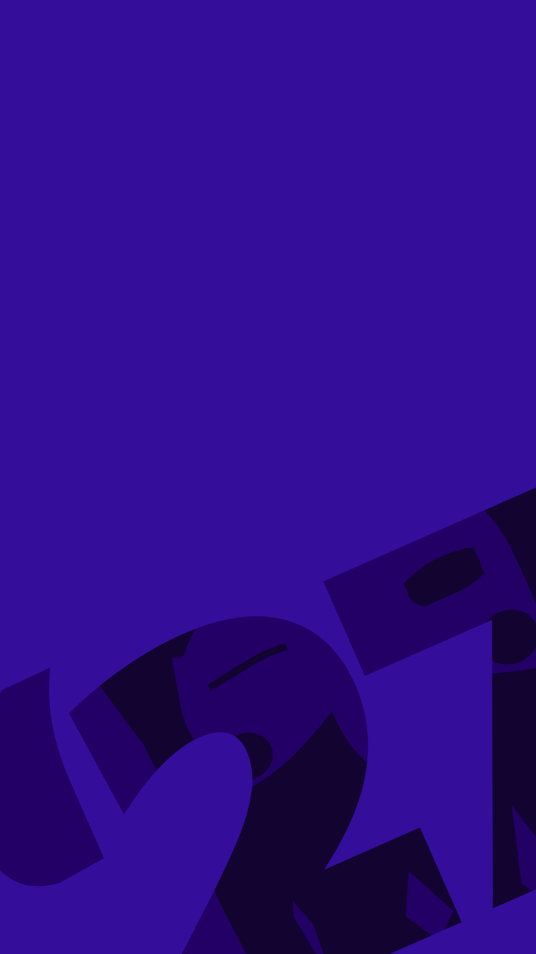
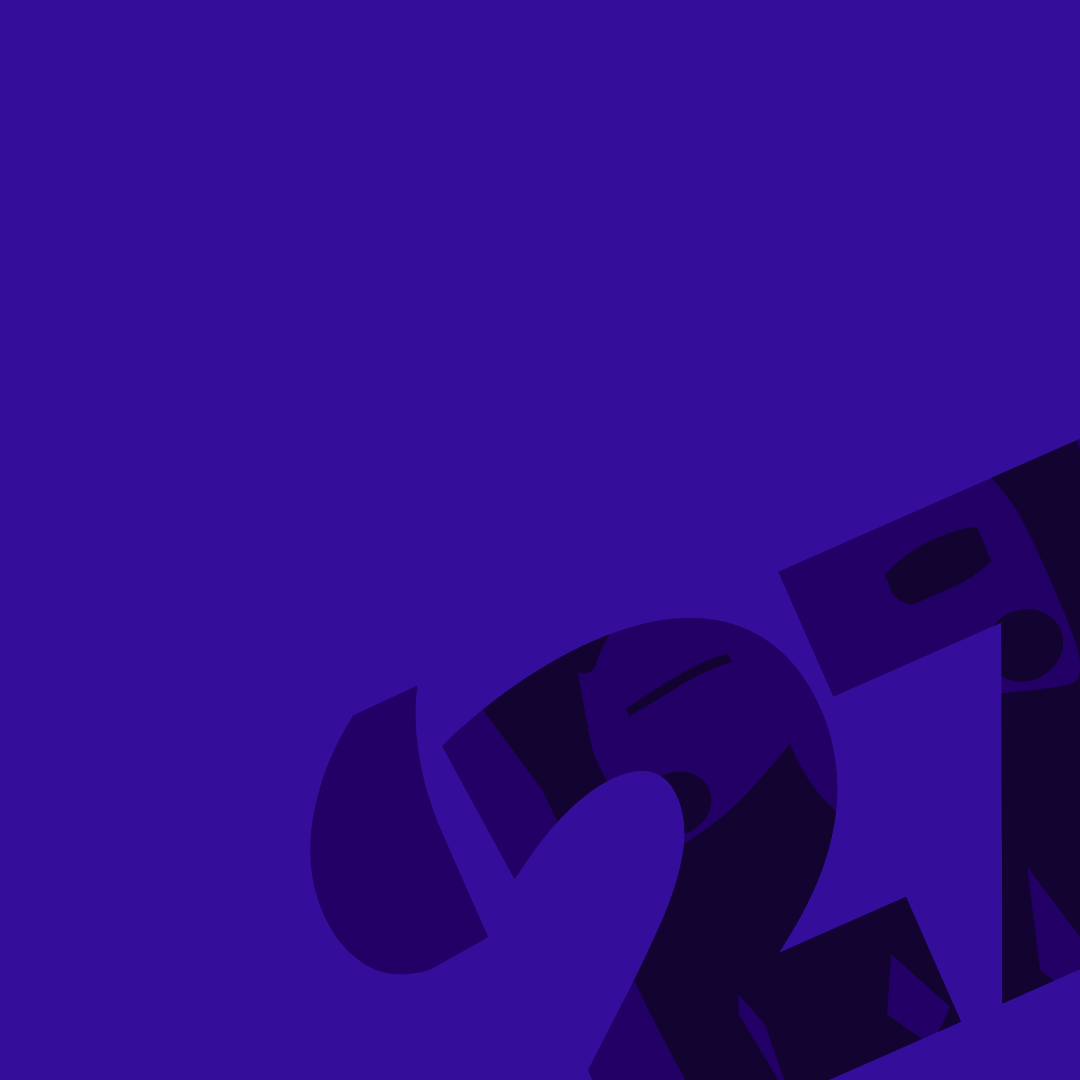
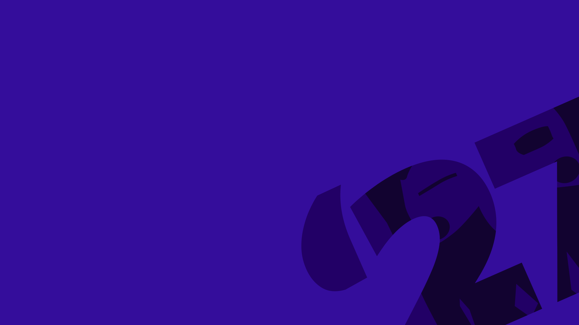
A purple background (ΝΙΟΝΙΟΣ) with the «’27» turned into a corner and cut off at the edge, in a slightly different purple. It is this year's carnival backdrop: at the top of pages, on posters, posts and tickets. The motif is faint on purpose, so a logo and a headline fit on top of it.
The identity's most recognisable device, and the way to put red on purple. Red lettering on purple cannot be read (2.2:1) and is not allowed. Use the red as a filled box, with white or near-black lettering inside. Use it for the one thing that must not be missed: the date, the time, the price.
One or two plaques per surface. With a third, none of them stands out.
A film, a year or an event appears as a band with its photograph edge to edge and the title on it, not as a thumbnail inside a card. Without a photograph the band stands on deep purple — never in a grey box.
The whole film
The mask goes in as a watermark once per screen, at the lower right of the deep field, cropped by the edge — never over a photograph and never behind text that has to be read.
Based on the 2025 and 2026 posters and stories — the style the carnival already has. The same four things every time: lime for the loudest line, a filled plaque for what must not be missed, white for the rest of the text, and the signature in a corner the motif is not using.
ΣΑΒΒΑΤΟ 31 ΙΑΝΟΥΑΡΙΟΥ
ΑΝΟΙΓΜΑ ΤΟΥ ΤΡΙΩΔΙΟΥμαζευόμαστε στην αποθήκη
#μπλόκο_ποταμιάς
@potamiacarnival
@potamiacarnival
For the groups who hold a card with their lines on the float. Print it double-sided: your lines on the front, the carnival backdrop on the back. Then whenever the card turns towards a camera, it shows the carnival.
ΑΡΜΑ · ΙΝΔΙΑΝΟΙ
Our lines
2027
@potamiacarnival
The association signs everything that lasts; the 2027 carnival signs the celebration. Choose below which logo you need. Every file can be downloaded further down.
Anything about this year’s carnival: posters, posts, tickets, t-shirts, the celebration's pages. Redrawn every year.
The association itself — letters, notices, the AGM, sponsor decks, anything that outlives one carnival.
The carnival in general, with no year attached. Archive pages, the top of the website, permanent signs.
One signature per surface. If it is about the association, ΔΙΟΝΥΣΟΣ signs it; if it is about the 2027 carnival, 2027 does. They appear together only when the association publishes something about the 2027 carnival — and then in separate zones, never side by side.
colourmono · winemono · blackmono · whiteEvery file, shown on the background it was made for. They are always the current ones.
seasonal-2027SVGDownload
seasonal-2027-whiteSVGOne ink, white. For dark grounds and photographs, where the colour logo doesn't read.Download
seasonal-2027-blackSVGOne ink, black. For black-and-white print: newspapers, photocopies, stamps.Download
seasonal-2027-wineSVGOne ink, the association's red. For light grounds when printing with a single ink.Download
seasonal-2027-duotone-onlightSVGTwo inks, for light grounds: paper, white T-shirts. For two-colour screen printing.Download
seasonal-2027-duotone-ondarkSVGTwo inks, for dark grounds. For screen printing or embroidery on dark fabric.DownloadAll are SVG files. They open in Illustrator, Inkscape, Figma, Canva and Word, scale from a keyring to a banner without losing quality, and have no background of their own — the chequerboard in the preview means transparency. If you need PNG or EPS, write to us; don't enlarge a screenshot.
Free for any use that concerns or covers the carnival. For commercial use, ask the association first.
The six mistakes that happen again and again. They apply to every logo.
Eight rules for every screen on the site and every poster. If a page breaks one, the page changes, not the rule.
The ΔΙΟΝΥΣΟΣ mask is drawn two ways, and which one to use is decided by the background — not by taste.
Around every logo there is a zone that stays empty: ¼ of the logo's height, on every side.
The same rule for every logo, the association's and the carnival's. The zone grows with the logo, so nobody needs a table. Nothing goes inside it: not text, not a line, not the busy edge of a photograph, not another logo, not the edge of the page. When the logo sits on a colour plaque, the plaque's edge is the limit.
The six things that make the difference when you are working from a phone.
Download the vertical (story), square or horizontal one from the files. They are already the right size and carry this year's motif.
One thing in lime caps, large. Everything else smaller and white. Two loud lines means none.
The red box with white lettering is our trademark. Never red type on the purple — it cannot be read.
Smaller than that it turns into a smudge. If it does not fit, use the white single-colour version (mono) at a smaller size, or leave the logo off.
Clear space the height of the «Κ» on every side. A logo pressed against an edge looks like a mistake, not a design.
No filters, no shadows, no stretching. There is a ready version for every background — pick one, do not make one.
If what you are making does not fit any of the above, or you need a file in another format, write to us. We answer, and we send what is needed.