
The 2027 logo
Anything about this year’s carnival: posters, posts, tickets, t-shirts, the celebration's pages. Redrawn every year.
Brand guide
The whole design system of the website: all its components, colours and states.
The carnival of a village on Thassos, run by the villagers themselves — not by a council, not by a company.
Every winter the village's groups build floats and write satirical sketches — about current affairs and politics, about local Thassos affairs, sometimes about history or the twelve gods — and take to the square on the last Sunday of carnival. It is organised by the «Dionysos» cultural association. It is not staged for tourists: it is a village making fun of itself — but anyone who turns up is in it.
The custom is far older than the parade. There is no precise historical record, only stories handed down from our grandparents' great-grandparents — the «camel» custom, which we recently revived, and the men who went out at night dressed as animals and walked into the cafés. It is Dionysian, which is why the association took the name «Dionysos»: we celebrate wine, dance, revelry, eros and the phallic symbols that go with them. Some may find that shocking — for these days of the year there is no shame in it.
The float parade in its present form began in 1987. The association digitises and catalogues whatever survives — parades, floats, songs, photographs — and the archive is still growing. 25 of the 36 years have a video of the parade; the rest do not, and we say so openly.
Preparation starts just after Christmas and runs two to three months: the association's members and dozens of village volunteers build the floats. The events open with Triodion, and the parade falls in February or March depending on the year. Afterwards the square becomes a party, with wine and food for everyone. All of it is volunteer work, backed by every business in the village.
“The Potamia Carnival is the carnival of the village of Potamia on Thassos: a Dionysian custom many generations old, whose satirical float parade has taken its present form since 1987, organised by the «Dionysos» Folklore and Cultural Association through the volunteer work of its residents.”
This sentence may be used verbatim in an article, press release or video description without asking us.
Our identity has two voices. The “DIONYSOS” association speaks all year round: calm, clear, on white. The carnival speaks for one celebration: loud, nocturnal, on purple. The two voices never mix. Before you design anything, decide who is speaking.
«DIONYSOS» Folklore & Cultural Association of Potamia — Potamia, Thassos.
Καρναβάλι Ποταμιάς
Notices, news, forms — the association's everyday voice.
White and off-white surfaces, plenty of ΚΡΑΣΙ in buttons and links, and a hint of purple hidden in the dark text. A serious slab-serif face. This is what announcements, news, forms and admin look like.
Potamia · Thassos
Carnival
The celebration, the floats, every year's archive.
Purple surfaces, white text, ΚΡΑΣΙ on the buttons, and the year's detail colour glowing in headlines and touches. Uppercase, heavy, festive type. This is what the celebration's pages look like.
Four rules that are often forgotten.
| Write | Not | Why |
|---|---|---|
| Ποταμιά, Θάσος | Potamia Carnival Festival | Greek is the language of the celebration. English goes beside it, never instead of it. |
| the floats, the παρέες | the teams' floats | They are παρέες — groups of friends, not teams. That is what the village calls them. |
| Come to the square | Don't miss it!!! | The carnival does not need exclamation marks. It invites; it does not advertise. |
| the «Dionysos» association | the organising committee | It has a name and it is a members' association. Use it. |
The carnival is «Καρναβάλι Ποταμιάς» and the association is «Διόνυσος». They are two different things, and only the second one organises anything.
No designer's eye needed — just proportions. If a page or poster keeps roughly these ratios, it will look like ours.
Association (light)
Carnival (dark)
The colours are not used in equal amounts. With these proportions, a poster, a post and a web page all look like the same carnival.
Tap here28 Feb
Red is the action — the screen's one button and the date box. Lime (the year's colour) is the fact that shouts: a date, a number, a year. If lime is tappable or red merely informs, somebody will confuse the two.
nionios-30065%stachti-10015%rave-10012%krasi-2008%Rough proportions, not a rule to measure. If the detail colour starts to look like the background, it has taken too much space.
Three recognisable colours plus a neutral. The colours stay vivid on every step: the dark steps are deep, never dull. Every colour on the website is one of these.
What each step does: 100 shines on dark backgrounds · 200 fills the buttons · 300 is deeper, for a button being pressed · 400 is for text on light backgrounds · 500 is for emphasised text · 600 is near-black, with a hint of the colour — backgrounds only, never text.
Rave — neon, electricity, the speakers once night falls. This is what the celebration sounds and looks like once it begins.
Joy — confetti and the warmth of the community that comes to the celebration. Warm and friendly, not electric.
Serpantina — the paper streamer thrown from the floats. Electric pink, playful and bright.
The river — the water Potamia is named after. Electric cyan, cool and clear.
One detail colour per carnival. Never two at once, never a new one. ΚΡΑΣΙ and ΝΙΟΝΙΟΣ never change.
Don't pick something dark “to be safe”: here a dull colour is a worse mistake than a loud one. Pick the brightest step that can still be read. Which step that is depends on what the colour is doing:
A fill (tag, badge, button): what matters is how clearly the letters ON it stand out. The dark colours (ΚΡΑΣΙ, ΝΙΟΝΙΟΣ, ΣΕΡΠΑΝΤΙΝΑ) fill at 200, with white letters. The bright ones (RAVE, ΧΑΡΑ, ΠΟΤΑΜΙ) fill at the step that glows, with dark letters. A bright colour on a dark step turns to mud.
Text: what matters is how clearly it stands out from the BACKGROUND, and the hardest background is the light page. That is why text usually goes one step below the fill. RAVE is the hard case: it goes two.
These three are the carnival, every year. They are not substituted and not “corrected” to match something else.
Ash — inspired by smoke, the charcoal from the grill, and white from traditional costumes. The neutral surface of the association.
Light backgrounds, white cards, grey rules and shadows, dark video surfaces. Whatever needs no colour takes ΣΤΑΧΤΗ.
Wine — Dionysos' gift, the carnival's free wine. The red that ties the association to the celebration.
The main buttons, everywhere. Links and accents on the association's light pages; highlight boxes and details on the carnival's dark backgrounds. Bright step on dark backgrounds, deep step on light ones.
Nionios — the colour of Dionysos' robes; he is the carnival's mascot.
The background of every carnival page, the card outlines and glows. In the association's voice it appears only as a trace: the near-black 600 is the text colour. Never large purple surfaces on association pages.
Every carnival is always the purple and the red, plus ONE detail colour picked for the year. For Carnival '27 it is RAVE — the neon greens. The other three wait their turn: a future carnival may pick the amber, the electric pink or the cyan. Never two detail colours in the same year.
Rave — neon, electricity, the speakers once night falls. This is what the celebration sounds and looks like once it begins.
Carnival '27's detail colour: headlines, accents and touches on the purple surfaces. As text on light backgrounds only the 500 step — the bright steps can't be read there.
Joy — confetti and the warmth of the community that comes to the celebration. Warm and friendly, not electric.
One of the detail colours, ready for a future year. It is also the colour of warnings on the website. Bold and vivid, visible from far away at the parade.
Serpantina — the paper streamer thrown from the floats. Electric pink, playful and bright.
One of the detail colours, ready for a future year. A dark colour like ΚΡΑΣΙ: it takes white lettering on top.
The river — the water Potamia is named after. Electric cyan, cool and clear.
One of the detail colours, ready for a future year. A bright colour like RAVE: it shines on dark backgrounds, and for text on light backgrounds it goes to step 400.
Every carnival has ONE detail colour, from the four above — never two, never a new one. Change it here and see what changes with it: the button, the link, the outline, the shadow. The backgrounds, the text, the wine red and the message colours stay the same every year.
Detail colour
This is how a year's page looks in this colour. The association changes it themselves, with no developer.
Two voices: the association's serious one (Roboto Slab) and the carnival's festive one (Commissioner, all caps). Body copy is always Roboto Slab, in both.
| Typeface | For | Where |
|---|---|---|
| Commissioner 800/900 | Headlines and plaques, all caps | Anything read from a distance: posters, banners, float names, the one loud line |
| Roboto Slab 400/700 | Body copy, captions, small print | Anything actually read: paragraphs, times, instructions, association notices |
Body copy is always Roboto Slab, in both voices. A poster whose small print is set in Commissioner reads as a nightclub flyer.
Three sizes per screen: one title, the text, and the small line for dates and details. A fourth size is a sign that the screen is trying to say two things — split it.
The association's voice
Καρναβάλι
Ο Νιόνιος επιστρέφει
Άρματα & Θεατρικά
The digital archive of the Potamia carnival — video, photographs and stories from every year. Test ΐ ΰ ς Ά Έ Ή Ί Ό Ύ Ώ.
Roboto Slab Regular · caption / attribution
The carnival's voice
Καρναβάλι
Ο Νιόνιος επιστρέφει
Άρματα & Θεατρικά
The digital archive of the Potamia carnival — video, photographs and stories from every year. Test ΐ ΰ ς Ά Έ Ή Ί Ό Ύ Ώ.
Roboto Slab Regular · caption / attribution
If you are lettering with a brush on wood or cloth, these are the shapes. Keep them upright and tight.
ΑΒΓΔΕΖΗΘΙΚΛΜΝΞΟΠΡΣΤΥΦΧΨΩ
ΆΈΉΊΌΎΏΪΫ
0123456789 & · — ’
Accents are the first thing lost when copying by eye. Greek all-caps takes no accent: «ΠΟΤΑΜΙΑΣ», «ΚΑΡΝΑΒΑΛΙ». Wherever the text is not all caps, the accent stays.
The icons on the website are ready-made (Microsoft Fluent), except three we drew ourselves, because no ready-made set has a carnival float or a wine barrel. The mask is not an icon: it is the association's badge.
The mask — the «Dionysos» badge
Wherever a mask is needed, the association's badge goes in as it is. Never a redrawn mask, never a generic theatre mask.
The barrel — Dionysos' wine
The wine barrel — not a glass, not a bottle.
The float — the parade
The float, not a lorry.
The vine — the association
The vine, the village's own.
You will find them with the rest of the files, as SVG. They are single-colour and look right at any size, from very small (16px) to a wall.
Colours for the website's messages: success, error, warning, information. One colour for each, in three tones: one for text, a more vivid one for fills and one for dark backgrounds. They are never brand colours: the error red is deliberately different from ΚΡΑΣΙ, so that a delete never looks like a brand button, and success is emerald, not RAVE.
danger
success
warning
info
The same colours in use: status labels, solid and soft.
The association signs everything that lasts; the 2027 carnival signs the celebration. Choose below which logo you need. Every file can be downloaded further down.
Anything about this year’s carnival: posters, posts, tickets, t-shirts, the celebration's pages. Redrawn every year.
The association itself — letters, notices, the AGM, sponsor decks, anything that outlives one carnival.
The carnival in general, with no year attached. Archive pages, the top of the website, permanent signs.
One signature per surface. If it is about the association, ΔΙΟΝΥΣΟΣ signs it; if it is about the 2027 carnival, 2027 does. They appear together only when the association publishes something about the 2027 carnival — and then in separate zones, never side by side.
colour
mono · wine
mono · black
mono · whiteFor this year's logo there are only the versions its designer supplied. Download it from the files below, and write to us if you need another format.
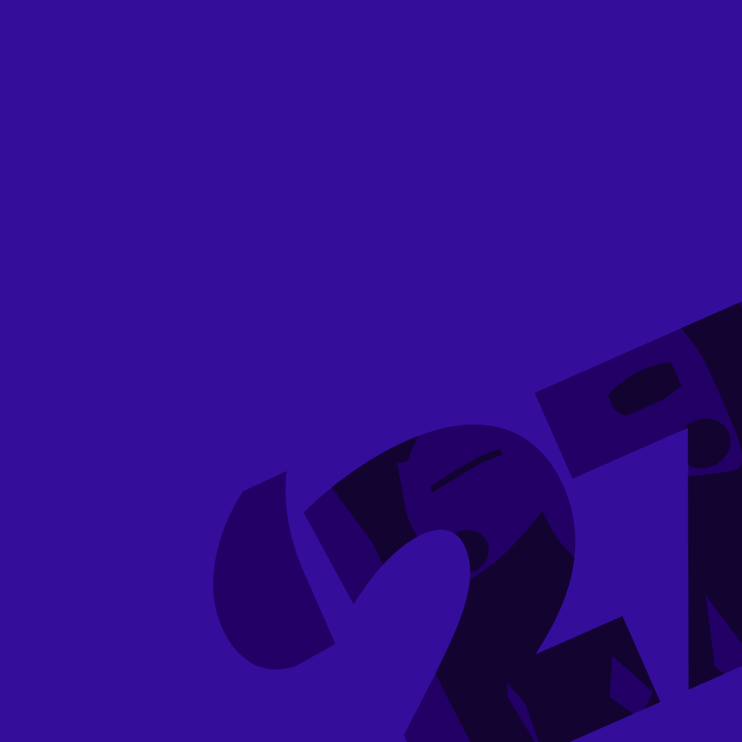
A purple background (ΝΙΟΝΙΟΣ) with the «’27» turned into a corner and cut off at the edge, in a slightly different purple. It is this year's carnival backdrop: at the top of pages, on posters, posts and tickets. The motif is faint on purpose, so a logo and a headline fit on top of it.
The identity's most recognisable device, and the way to put red on purple. Red lettering on purple cannot be read (2.2:1) and is not allowed. Use the red as a filled box, with white or near-black lettering inside. Use it for the one thing that must not be missed: the date, the time, the price.
One or two plaques per surface. With a third, none of them stands out.
A film, a year or an event appears as a band with its photograph edge to edge and the title on it, not as a thumbnail inside a card. Without a photograph the band stands on deep purple — never in a grey box.
The whole film
The mask goes in as a watermark once per screen, at the lower right of the deep field, cropped by the edge — never over a photograph and never behind text that has to be read.
Based on the 2025 and 2026 posters and stories — the style the carnival already has. The same four things every time: lime for the loudest line, a filled plaque for what must not be missed, white for the rest of the text, and the signature in a corner the motif is not using.

14–17 February 2027 · Potamia, Thasos
Raffle
Raffle tickets are out

ΚΥΡΙΑΚΗ
22 ΦΕΒΡΟΥΑΡΙΟΥ στις 13:00
στην κεντρική πλατεία
ΠΛΟΥΣΙΑ ΔΩΡΑ
@potamiacarnival
ΣΑΒΒΑΤΟ 31 ΙΑΝΟΥΑΡΙΟΥ
ΑΝΟΙΓΜΑ ΤΟΥ ΤΡΙΩΔΙΟΥμαζευόμαστε στην αποθήκη
#μπλόκο_ποταμιάς
@potamiacarnival
 ΕΙΣΟΔΟΣ 3€
@potamiacarnival
ΛΑΧΝΟΣ
0472
The six mistakes that happen again and again. They apply to every logo.
Eight rules for every screen on the site and every poster. If a page breaks one, the page changes, not the rule.
The ΔΙΟΝΥΣΟΣ mask is drawn two ways, and which one to use is decided by the background — not by taste.
Around every logo there is a zone that stays empty: ¼ of the logo's height, on every side.
The same rule for every logo, the association's and the carnival's. The zone grows with the logo, so nobody needs a table. Nothing goes inside it: not text, not a line, not the busy edge of a photograph, not another logo, not the edge of the page. When the logo sits on a colour plaque, the plaque's edge is the limit.
In a sponsor row the logos have different shapes, so equal height does not mean equal size. Match them by eye, not by the ruler.
Sponsor row — all look the same size, in one colour.
ΧΟΡΗΓΟΣΔΗΜΟΣThree phrases that cover nearly every case. Copy them as they are.
| When | Write |
|---|---|
| An article or announcement about the celebration | Καρναβάλι Ποταμιάς — the Potamia Carnival |
| When naming who organises it | «Dionysos» Cultural Association of Potamia |
| A caption on a photograph or video from our archive | Photo: Potamia Carnival Archive |
The logos may be used freely to report on or cover the carnival. Commercial use — a product for sale, a sponsored campaign, packaging — needs the association's permission. Ask us; the answer is usually yes.
Every file, shown on the background it was made for. They are always the current ones.

dionysos-badge-solid-wine74 × 90Download
dionysos-badge-solid-black74 × 90Download
dionysos-badge-outline-white76 × 91Download
dionysos-horizontal-solid-onlight266 × 90Download
dionysos-horizontal-solid-black266 × 90Download
dionysos-horizontal-outline-ondark270 × 91Download
dionysos-horizontal-outline-white270 × 91Download
dionysos-vertical-solid-onlight184 × 188Download
dionysos-vertical-solid-black184 × 188Download
dionysos-vertical-outline-ondark184 × 189Download
dionysos-vertical-outline-white184 × 189Download
dionysos-horizontal-compact-solid-wine266 × 90Download
dionysos-horizontal-compact-solid-black266 × 90Download
dionysos-horizontal-compact-outline-white270 × 91Download
dionysos-vertical-compact-solid-wine184 × 153Download
dionysos-vertical-compact-solid-black184 × 153Download
dionysos-vertical-compact-outline-white184 × 154DownloadAll are SVG files. They open in Illustrator, Inkscape, Figma, Canva and Word, scale from a keyring to a banner without losing quality, and have no background of their own — the chequerboard in the preview means transparency. If you need PNG or EPS, write to us; don't enlarge a screenshot.
Free for any use that concerns or covers the carnival. For commercial use, ask the association first.
The measurements behind the rules above. Open one only if you need the number.
Only two of the logo's colours touch the background: the lime, which is bright, and the red, which is mid-toned. A background that flatters one tends to swallow the other. The logo looks best on dark backgrounds.
| Background | ΚΑΡΝΑΒΑΛΙkrasi-100 | «27»rave-200 | Result |
|---|---|---|---|
stachti-700 | 5.4:1 | 13.2:1 | ✓ Ideal — both colours stand out clearly. |
nionios-400 | 4.7:1 | 11.3:1 | ✓ Ideal — both colours stand out clearly. |
nionios-300 · the backdrop | 3.5:1 | 8.5:1 | ✓ Ideal — both colours stand out clearly. |
stachti-600 | 3.6:1 | 8.7:1 | ✓ Ideal — both colours stand out clearly. |
stachti-100 | 3.6:1 | 1.5:1 | ✓ Large sizes only — one colour looks too much like the background. |
stachti-200 | 3.2:1 | 1.3:1 | ✓ Large sizes only — one colour looks too much like the background. |
nionios-200 | 2.3:1 | 5.6:1 | ✓ Large sizes only — one colour looks too much like the background. |
hara-100 | 2.2:1 | 1.1:1 | ✗ No — use the single-colour version (mono), or put a colour plaque underneath. |
The contrast limits for text (WCAG) do not apply to logos. Here 3:1 is the limit below which a large shape no longer stands out from its background.
Every logo exists in three forms. “full” is the whole logo; “compact” is without the line of small type — «Λαογραφικός…» for the association, «byΔΙΟΝΥΣΟΣ» for the carnival; “mark” is the badge alone. All three are the same drawing.
On the website the tier changes by itself with the size: the logo loses its small type before it can blur. Below 16px no logo is used; only the site icon (favicon) goes there, and it is drawn separately for that size.
The year's logo has no tiers; it has a minimum size. Colour: 96px wide on screen, 30mm in print. With the mask it needs more: 128px / 40mm. Smaller than that, the website removes the mask by itself and shows the “colour” version, which is always safe.
64px ✗80px ✗96px ✓128px ✓200px ✓The association speaks all year; the year's logo speaks for one celebration. If the piece is about the association, DIONYSOS signs it. If it is about the 2027 carnival, 2027 signs it.
| Where | Logo | Version | Why |
|---|---|---|---|
| Website — menu / footer | DIONYSOS / Carnival horizontal | tone auto | The association is the site's permanent host. |
| 2027 page / top of a page | 2027 logo | colour, ≥ 200px | The carnival page is purple — the mask vanishes there. |
| White card, invitation, programme | 2027 logo | masked · white | The full signature, where it has room to breathe. |
| Social post / story | 2027 logo | colour or masked | Check the background first; on a photo put a plaque underneath. |
| Video, TV, projection | 2027 logo | colour or mono · white | The mask gets lost when video is compressed and when blacks wash out. |
| Poster, banner | 2027 logo | whatever fits the background | Large format: the version with the mask (masked) is worth it here, if the background is right. |
| T-shirt, embroidery | 2027 logo | duotone or mono | Few colours / few threads — the fine shades get lost anyway. |
| Food wrap, cup, napkin | 2027 logo | mono · wine or black | One ink, cheap printing, absorbent paper. |
| Sticker, raffle tag | 2027 logo | colour, ≥ 30mm | Small but colourful; below 30mm it doesn't go on at all. |
| Newspaper, fax, stamp, engraving | 2027 or DIONYSOS | mono · black | One ink, no midtones. |
| Site icon / app icon | DIONYSOS | favicon.svg | Redrawn on a colour plaque, not simply shrunk — and never the 2027. |
The whole website has one way of showing what can be pressed. Anything that cannot be pressed is flat: no glow, no shadow, no movement. Anything you can press or drag looks like an object resting on the page, and it lifts when the pointer comes near.
In both cases the element moves very slightly, with a short, slightly springy motion. The bigger it is, the more it lifts: a tag barely, a button like a key, a card as a whole. For people who have asked their device for less motion, only the shadows change.
Colour alone is not enough: people who are colour-blind cannot tell it apart, and it does not show well in the sun at a parade or on a phone screen. The lift is a second sign that says “this can be pressed”, with no colour needed. Because it is the same everywhere, anyone who sees it on a button recognises it on the sponsorship packages, the event card, the filters and the page numbers. For people using a keyboard there is a separate outline, always visible.
There are three exceptions. Cards always have a small shadow, so they stand out from the page; the ones that can be pressed simply lift further. Form fields do the opposite: they sink when you type in them and stay that way. Links inside text keep their underline and do not lift.
Move the pointer over each one and press it — the last plate cannot be pressed.
Anything that gets pressed. Move the pointer over a button to see it lift, and press it to see it sink. There are buttons with text and buttons with an icon; disabled ones take the colour of the surface beneath them.
association-light · bg/page (stachti-200)
association-light · surface/card (stachti-100)
carnival · bg/page (nionios-400)
carnival · surface/card (nionios blend)
carnival-night · bg/page (grey-900)
Small labels that say what something is — “Archive”, “New”, “Grand sponsor”. They aren't pressed (unless they're a filter), so they stay flat on the surface.
association-light · bg/page (stachti-200)
association-light · surface/card (stachti-100)
carnival · bg/page (nionios-400)
carnival · surface/card (nionios blend)
carnival-night · bg/page (grey-900)
What stage something is at — a float that was submitted, a comment awaiting approval. It uses the state colours, not the brand colours, so a list in the admin never looks like a parade float.
association-light · bg/page (stachti-200)
association-light · surface/card (stachti-100)
carnival · bg/page (nionios-400)
carnival · surface/card (nionios blend)
carnival-night · bg/page (grey-900)
The “we are broadcasting now” badge. When nothing is live, nothing shows, and no empty space is left in its place.
association-light · bg/page (stachti-200)
association-light · surface/card (stachti-100)
carnival · bg/page (nionios-400)
carnival · surface/card (nionios blend)
carnival-night · bg/page (grey-900)
A member's photo. When there is none, their initials appear on a colour that is always the same for the same person.
association-light · bg/page (stachti-200)

association-light · surface/card (stachti-100)
carnival · bg/page (nionios-400)
carnival · surface/card (nionios blend)
carnival-night · bg/page (grey-900)
Many people in a small space — for a float's members or the people who commented. The rest are gathered into a “+N”.
association-light · bg/page (stachti-200)
association-light · surface/card (stachti-100)
carnival · bg/page (nionios-400)
carnival · surface/card (nionios blend)
carnival-night · bg/page (grey-900)
The row is for lists — board members, comments, participants — with a second line for the role. The small name label shows who appears in a photograph.
association-light · bg/page (stachti-200)
Μεγάληassociation-light · surface/card (stachti-100)
Μεγάληcarnival · bg/page (nionios-400)
Μεγάληcarnival · surface/card (nionios blend)
Μεγάληcarnival-night · bg/page (grey-900)
ΜεγάληThe fields people fill in. The label is always visible — it doesn't vanish once you start typing. Press into a field: it sinks slightly, exactly like a pressed button.
association-light · bg/page (stachti-200)
Έτσι θα εμφανίζεται στο πρόγραμμα.
Δεν μοιάζει με σωστή διεύθυνση email.
Μεγαλώνει όσο γράφετε. Σταματά στις 12 σειρές και μετά κυλάει.
53 / 600
association-light · surface/card (stachti-100)
Έτσι θα εμφανίζεται στο πρόγραμμα.
Δεν μοιάζει με σωστή διεύθυνση email.
Μεγαλώνει όσο γράφετε. Σταματά στις 12 σειρές και μετά κυλάει.
53 / 600
carnival · bg/page (nionios-400)
Έτσι θα εμφανίζεται στο πρόγραμμα.
Δεν μοιάζει με σωστή διεύθυνση email.
Μεγαλώνει όσο γράφετε. Σταματά στις 12 σειρές και μετά κυλάει.
53 / 600
carnival · surface/card (nionios blend)
Έτσι θα εμφανίζεται στο πρόγραμμα.
Δεν μοιάζει με σωστή διεύθυνση email.
Μεγαλώνει όσο γράφετε. Σταματά στις 12 σειρές και μετά κυλάει.
53 / 600
carnival-night · bg/page (grey-900)
Έτσι θα εμφανίζεται στο πρόγραμμα.
Δεν μοιάζει με σωστή διεύθυνση email.
Μεγαλώνει όσο γράφετε. Σταματά στις 12 σειρές και μετά κυλάει.
53 / 600
Pick one from a list. It also opens with the keyboard, and if you start typing it goes to the matching option.
association-light · bg/page (stachti-200)
Με ομάδες και επεξήγηση ανά επιλογή.
Διαλέξτε μια χρονιά.
association-light · surface/card (stachti-100)
Με ομάδες και επεξήγηση ανά επιλογή.
Διαλέξτε μια χρονιά.
carnival · bg/page (nionios-400)
Με ομάδες και επεξήγηση ανά επιλογή.
Διαλέξτε μια χρονιά.
carnival · surface/card (nionios blend)
Με ομάδες και επεξήγηση ανά επιλογή.
Διαλέξτε μια χρονιά.
carnival-night · bg/page (grey-900)
Με ομάδες και επεξήγηση ανά επιλογή.
Διαλέξτε μια χρονιά.
Dates always in Greek format (day/month/year), whatever language the device is set to — so the parade day is never written wrong.
association-light · bg/page (stachti-200)
Με όριο: μόνο μέσα στο 2027.
association-light · surface/card (stachti-100)
Με όριο: μόνο μέσα στο 2027.
carnival · bg/page (nionios-400)
Με όριο: μόνο μέσα στο 2027.
carnival · surface/card (nionios blend)
Με όριο: μόνο μέσα στο 2027.
carnival-night · bg/page (grey-900)
Με όριο: μόνο μέσα στο 2027.
Square = pick as many as you like. Round = pick one. Switch = changes something immediately, no “save” — which is why it is never used for “I agree to the terms”.
association-light · bg/page (stachti-200)
association-light · surface/card (stachti-100)
carnival · bg/page (nionios-400)
carnival · surface/card (nionios blend)
carnival-night · bg/page (grey-900)
Drag a file onto it, or just tap it — on a phone there is no “drag”, so the whole box is a button.
association-light · bg/page (stachti-200)
idle
uploading
done
error
association-light · surface/card (stachti-100)
idle
uploading
done
error
carnival · bg/page (nionios-400)
idle
uploading
done
error
carnival · surface/card (nionios blend)
idle
uploading
done
error
carnival-night · bg/page (grey-900)
idle
uploading
done
error
Where you are inside a multi-step form and how much is left. On a narrow screen it becomes a bar with “Step 2 of 4”.
association-light · bg/page (stachti-200)
Step 2 of 4Περιγραφή
Step 2 of 4Περιγραφή
Step 2 of 4Περιγραφή
association-light · surface/card (stachti-100)
Step 2 of 4Περιγραφή
Step 2 of 4Περιγραφή
Step 2 of 4Περιγραφή
carnival · bg/page (nionios-400)
Step 2 of 4Περιγραφή
Step 2 of 4Περιγραφή
Step 2 of 4Περιγραφή
carnival · surface/card (nionios blend)
Step 2 of 4Περιγραφή
Step 2 of 4Περιγραφή
Step 2 of 4Περιγραφή
carnival-night · bg/page (grey-900)
Step 2 of 4Περιγραφή
Step 2 of 4Περιγραφή
Step 2 of 4Περιγραφή
How fields line up: one column when the space is narrow, two when it is wide. What counts is the width of the box they are in, not of the screen.
association-light · bg/page (stachti-200)
Τα χρειαζόμαστε μόνο για να σας απαντήσουμε. Δεν δημοσιεύονται πουθενά.
idle
The check is run by Cloudflare, with no tracking cookies.
verifying
verified
error
association-light · surface/card (stachti-100)
Τα χρειαζόμαστε μόνο για να σας απαντήσουμε. Δεν δημοσιεύονται πουθενά.
idle
The check is run by Cloudflare, with no tracking cookies.
verifying
verified
error
carnival · bg/page (nionios-400)
Τα χρειαζόμαστε μόνο για να σας απαντήσουμε. Δεν δημοσιεύονται πουθενά.
idle
The check is run by Cloudflare, with no tracking cookies.
verifying
verified
error
carnival · surface/card (nionios blend)
Τα χρειαζόμαστε μόνο για να σας απαντήσουμε. Δεν δημοσιεύονται πουθενά.
idle
The check is run by Cloudflare, with no tracking cookies.
verifying
verified
error
carnival-night · bg/page (grey-900)
Τα χρειαζόμαστε μόνο για να σας απαντήσουμε. Δεν δημοσιεύονται πουθενά.
idle
The check is run by Cloudflare, with no tracking cookies.
verifying
verified
error
Messages that appear after an action. Move the pointer over one and the timer pauses — a message never disappears while you are reading it.
Το βίντεο ανέβηκε
Θα είναι διαθέσιμο μόλις ολοκληρωθεί η επεξεργασία.
Η εγγραφή καταχωρήθηκε
Θα λάβετε email επιβεβαίωσης.
Λήγει η προθεσμία
Οι δηλώσεις αρμάτων κλείνουν σε 3 ημέρες.
Απέτυχε η αποστολή
Ελέγξτε τη σύνδεσή σας και δοκιμάστε ξανά.
Σε carnival mode
Η επιφάνεια αλλάζει, η σοβαρότητα όχι.
Με χρονόμετρο 8″
Το άρμα σας εγκρίθηκε.
Ο ξενιστής (PcToastHost + useToast()) είναι ένας ανά layout· τα κουμπιά ταΐζουν τον πραγματικό, κάτω-κέντρο.
Two ways of saying “coming”. The circle for short waits; the grey shapes when we already know what shape the thing on its way will have.
association-light · bg/page (stachti-200)
association-light · surface/card (stachti-100)
carnival · bg/page (nionios-400)
carnival · surface/card (nionios blend)
carnival-night · bg/page (grey-900)
What someone sees when there is no content yet, when they are lost, or when something went well.
Try the moods
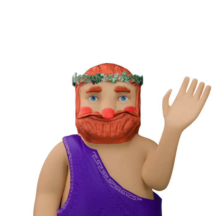
Every video starts and ends on the same neutral expression. When you change the mood, the video that is playing finishes first and then changes, so the change does not show. If you have asked for less motion, you see a still picture of the same scene.
association-light · bg/page (stachti-200)
Welcome
Your account is ready. Start with this year’s videos.
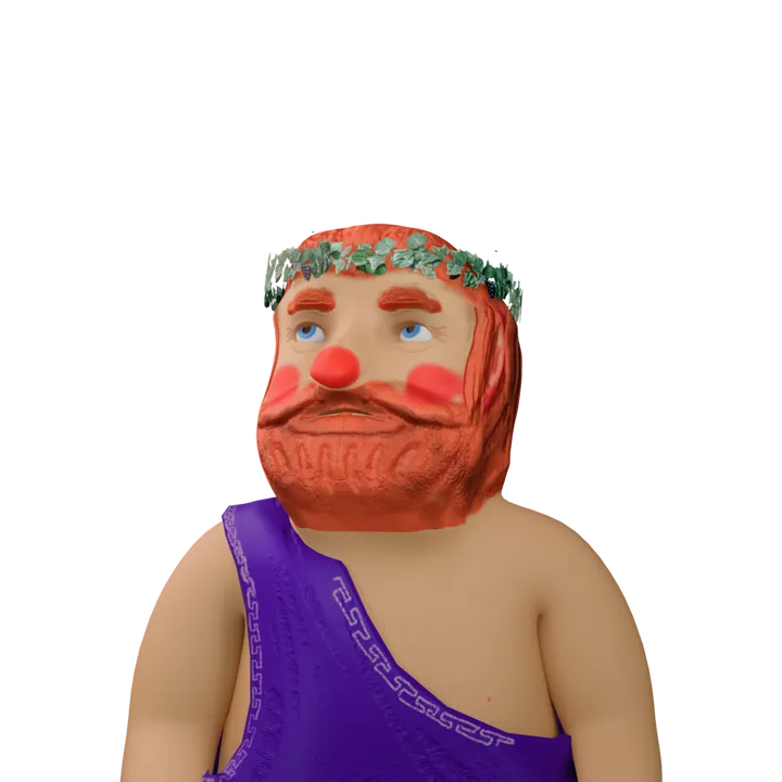
No videos yet
The moment the first video of the year is uploaded, it will appear here.
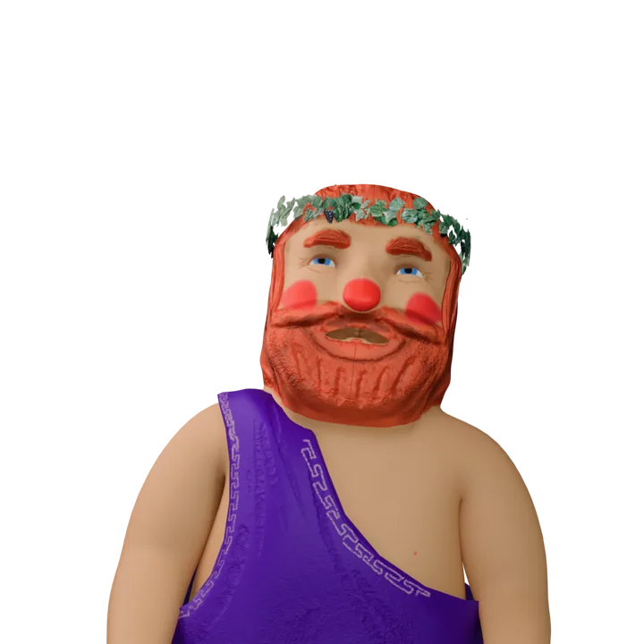
Page not found
Nionios got a little dizzy. Try starting from the top.
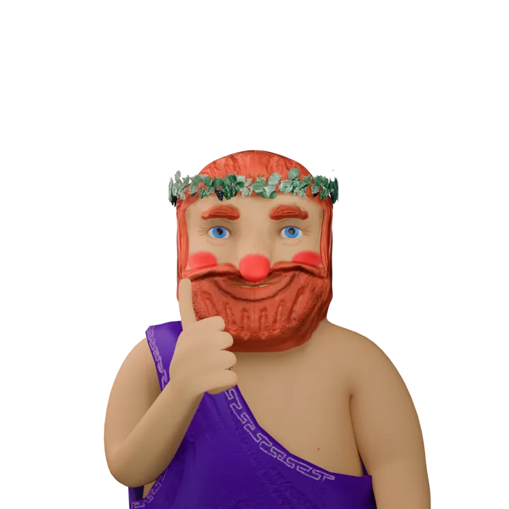
All done!
Your float entry has been registered.
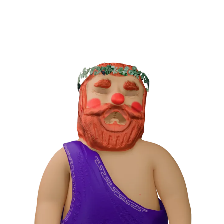
No connection
Check your connection and try again.
association-light · surface/card (stachti-100)
Welcome
Your account is ready. Start with this year’s videos.
No videos yet
The moment the first video of the year is uploaded, it will appear here.
Page not found
Nionios got a little dizzy. Try starting from the top.
All done!
Your float entry has been registered.
No connection
Check your connection and try again.
carnival · bg/page (nionios-400)
Welcome
Your account is ready. Start with this year’s videos.
No videos yet
The moment the first video of the year is uploaded, it will appear here.
Page not found
Nionios got a little dizzy. Try starting from the top.
All done!
Your float entry has been registered.
No connection
Check your connection and try again.
carnival · surface/card (nionios blend)
Welcome
Your account is ready. Start with this year’s videos.
No videos yet
The moment the first video of the year is uploaded, it will appear here.
Page not found
Nionios got a little dizzy. Try starting from the top.
All done!
Your float entry has been registered.
No connection
Check your connection and try again.
carnival-night · bg/page (grey-900)
Welcome
Your account is ready. Start with this year’s videos.
No videos yet
The moment the first video of the year is uploaded, it will appear here.
Page not found
Nionios got a little dizzy. Try starting from the top.
All done!
Your float entry has been registered.
No connection
Check your connection and try again.
A short explanation when you rest the pointer on something. It never hides anything essential, because phones have no pointer.
One choice out of a few, all of them visible — filters, tabs, the language switch. The tabs at the top of this page are the same component.
association-light · bg/page (stachti-200)
association-light · surface/card (stachti-100)
carnival · bg/page (nionios-400)
carnival · surface/card (nionios blend)
carnival-night · bg/page (grey-900)
How you move through long lists, and how you know where you are inside the archive.
association-light · bg/page (stachti-200)
association-light · surface/card (stachti-100)
carnival · bg/page (nionios-400)
carnival · surface/card (nionios blend)
carnival-night · bg/page (grey-900)
The headers that divide a page into sections, with an optional “see all” link, and the rules that divide groups of content.
association-light · bg/page (stachti-200)
Αρχείο
Ό,τι ανέβηκε τις τελευταίες εβδομάδες, από κάθε χρονιά.
association-light · surface/card (stachti-100)
Αρχείο
Ό,τι ανέβηκε τις τελευταίες εβδομάδες, από κάθε χρονιά.
carnival · bg/page (nionios-400)
Αρχείο
Ό,τι ανέβηκε τις τελευταίες εβδομάδες, από κάθε χρονιά.
carnival · surface/card (nionios blend)
Αρχείο
Ό,τι ανέβηκε τις τελευταίες εβδομάδες, από κάθε χρονιά.
carnival-night · bg/page (grey-900)
Αρχείο
Ό,τι ανέβηκε τις τελευταίες εβδομάδες, από κάθε χρονιά.
Every card is the summary of a page: it shows what someone needs in order to decide whether to open it, and nothing more. The same card is used three ways: in a grid, as a row for lists, and wide for the “story of the day”. The whole card can be pressed, and people who listen to the page with a screen reader hear only its title.
The date is the boldest thing on the card, because that is how a carnival programme is read. The price is often missing; when entry is free, “Free” is written in words. When an evening has two times (a walk at 19:00, a party at 22:00) both are shown: that is what people miss when they only read the title.
association-light · bg/page (stachti-200)
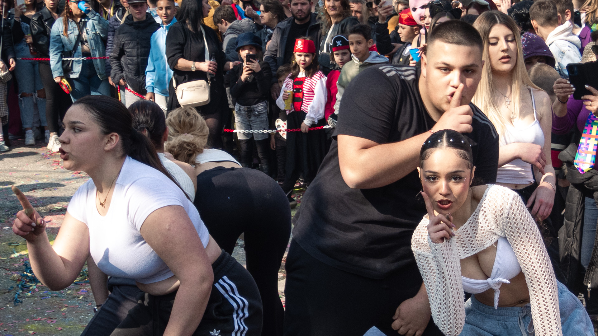
Theme: Ελεύθερο
Η παρέλαση των αρμάτων, δωρεάν κρασί για όλους και γλέντι μέχρι τα ξημερώματα.
Theme: ΙΝΔΙΑΝΟΙ
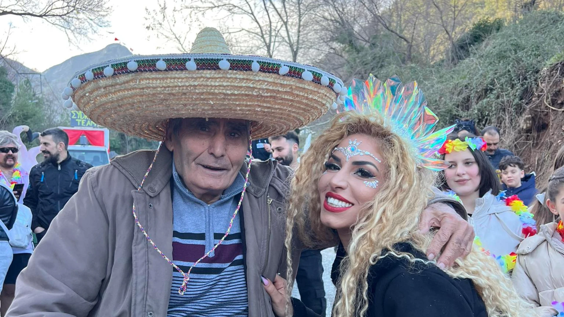
Ζωντανή μουσική και λαχειοφόρος με πλούσια δώρα — με το απόκομμα εισόδου.
association-light · surface/card (stachti-100)
Theme: Ελεύθερο
Η παρέλαση των αρμάτων, δωρεάν κρασί για όλους και γλέντι μέχρι τα ξημερώματα.
Theme: ΙΝΔΙΑΝΟΙ
Ζωντανή μουσική και λαχειοφόρος με πλούσια δώρα — με το απόκομμα εισόδου.
carnival · bg/page (nionios-400)
Theme: Ελεύθερο
Η παρέλαση των αρμάτων, δωρεάν κρασί για όλους και γλέντι μέχρι τα ξημερώματα.
Theme: ΙΝΔΙΑΝΟΙ
Ζωντανή μουσική και λαχειοφόρος με πλούσια δώρα — με το απόκομμα εισόδου.
carnival · surface/card (nionios blend)
Theme: Ελεύθερο
Η παρέλαση των αρμάτων, δωρεάν κρασί για όλους και γλέντι μέχρι τα ξημερώματα.
Theme: ΙΝΔΙΑΝΟΙ
Ζωντανή μουσική και λαχειοφόρος με πλούσια δώρα — με το απόκομμα εισόδου.
carnival-night · bg/page (grey-900)
Theme: Ελεύθερο
Η παρέλαση των αρμάτων, δωρεάν κρασί για όλους και γλέντι μέχρι τα ξημερώματα.
Theme: ΙΝΔΙΑΝΟΙ
Ζωντανή μουσική και λαχειοφόρος με πλούσια δώρα — με το απόκομμα εισόδου.
Wide card and rows (the last one is a past event)
Theme: Ελεύθερο
Η παρέλαση των αρμάτων, δωρεάν κρασί για όλους και γλέντι μέχρι τα ξημερώματα.
Theme: ΙΝΔΙΑΝΟΙ
Theme: Ελεύθερο
The badge says what kind of video it is: a full parade, highlights, the year’s advert, or “Confidential” from behind the scenes. “Archive” means it comes from the association’s old VHS tapes — a strength, not a flaw.
association-light · bg/page (stachti-200)
2026 · Float parade
1998 · Float parade · from tape
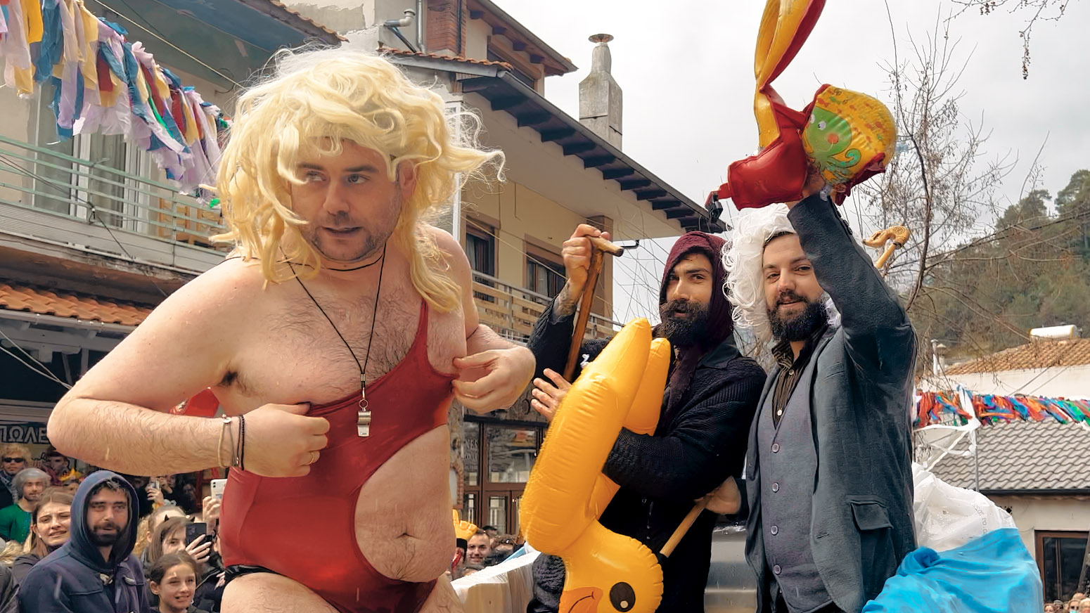
2026 · Highlights
2026 · Advert
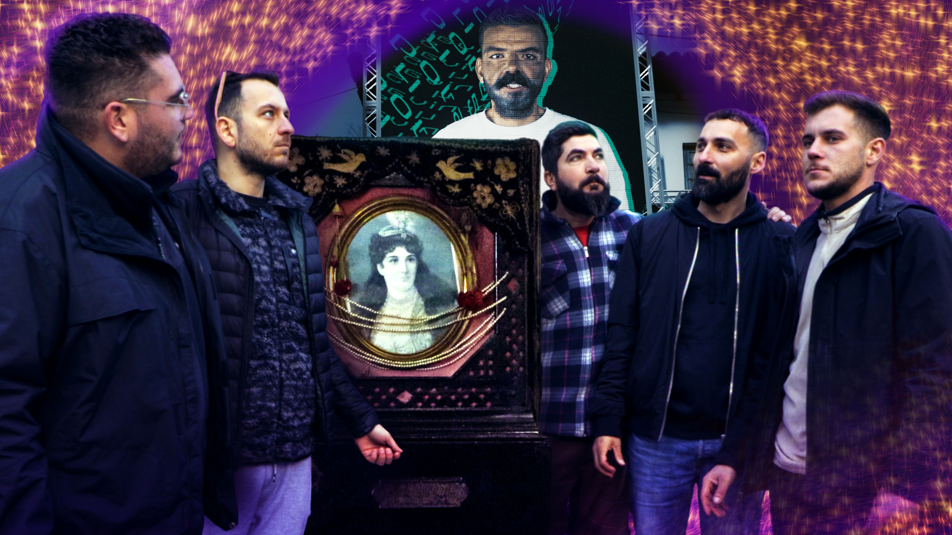
Επεισόδιο 2 · 2026 · Confidential Files
2027 · Advert
association-light · surface/card (stachti-100)
2026 · Float parade
1998 · Float parade · from tape
2026 · Highlights
2026 · Advert
Επεισόδιο 2 · 2026 · Confidential Files
2027 · Advert
carnival · bg/page (nionios-400)
2026 · Float parade
1998 · Float parade · from tape
2026 · Highlights
2026 · Advert
Επεισόδιο 2 · 2026 · Confidential Files
2027 · Advert
carnival · surface/card (nionios blend)
2026 · Float parade
1998 · Float parade · from tape
2026 · Highlights
2026 · Advert
Επεισόδιο 2 · 2026 · Confidential Files
2027 · Advert
carnival-night · bg/page (grey-900)
2026 · Float parade
1998 · Float parade · from tape
2026 · Highlights
2026 · Advert
Επεισόδιο 2 · 2026 · Confidential Files
2027 · Advert
As rows — for related videos and search results
2026 · Float parade
1998 · Float parade · from tape
2026 · Highlights
An album is a pile of photographs: the count shows it, and so do the two sheets peeking out from behind. The photographer’s name appears with the cover.
184 62Three kinds: the announcement (something you need to act on — it has a red edge), ordinary news, and a piece published elsewhere, which opens outside the website. A photo is optional; the card works without one too.
Όσοι θέλουν να κατεβάσουν άρμα φέτος, έχουν περιθώριο μέχρι την Παρασκευή στις 21:00.
Πάνω από 40 κασέτες από τα αρχεία του συλλόγου περνούν σε ψηφιακή μορφή.
Articles and special pages are built from the same eleven kinds of pieces. Text always has the same width, so it is easy to read. A piece the website does not recognise simply does not appear.
Το καρναβάλι της Ποταμιάς δεν ξεκίνησε το 1992 — εκεί ξεκινά το αρχείο. Η παρέλαση με άρματα, όπως τη ξέρουμε σήμερα, ξεκίνησε το 1987.
Πιο πίσω από αυτό δεν υπάρχει χρονολογία: υπάρχει το έθιμο της καμήλας, άντρες που έβγαιναν τη νύχτα ντυμένοι ζώα.
Ό,τι κι αν γίνει, το καρναβάλι θα γίνει.
Οι δηλώσεις κλείνουν την Παρασκευή στις 21:00.
Δηλώστε άρμαPhotos are often missing, especially for older members — then the initials appear, on a colour that is always the same for the same name. Past members become rows with their terms, because that is a list to read.
Πρόεδρος
Αντιπρόεδρος
Ταμίας
Γραμματέας
Δημήτρης Μερακλής
Δημοσίων Σχέσεων
Πέτρος Καζόλης
Μέλος
The association sets the sponsor levels itself, in the admin. The card has four forms: a large one with text, a small one with the logo, a plain mention by name, and the “with our thanks” block for the people who gave time, a space or their work instead of money — that is where people's own names are written. A sponsor’s logo is never cropped or recoloured, and always sits on a white background, because most are dark and would vanish into the purple.
Γιάννης Ισαλίδης · Νίκος Ισαλίδης — ιδιοκτήτες
Στηρίζει το καρναβάλι από την πρώτη χρονιά — και κερνάει το κρασί της παρέλασης.
Δρ. Παπαδόπουλος · Δρ. Ιωάννου — οι γιατροί μας
Ιατρική κάλυψη της παρέλασης
Ο χώρος για τα συνεργεία των αρμάτων
Four boxes, with no spinning or flashing digits. Until the page has loaded it shows dashes, so the time never jumps.
association-light · bg/page (stachti-200)
association-light · surface/card (stachti-100)
carnival · bg/page (nionios-400)
carnival · surface/card (nionios blend)
carnival-night · bg/page (grey-900)
Filters are not tabs: they hide things from a list, and you can choose several at once or none. Screen readers announce them that way too. A filter with no results stays in place, disabled. The share buttons load nothing from other companies.
Here you choose a package: you press a card and it is selected, and screen readers say so too. The amount is the title, because that is what people look at first. The last card is for an amount of your choice.
από 500 €
από 250 €
από 80 €
Ελεύθερο ποσό
Ό,τι μπορείτε — κάθε ευρώ πάει στα άρματα.
The most-used spot of the night: people standing in a square, holding a phone and a paper ticket. A number keypad, a big button, and the answer appears right there, with no need to look further down.
Try the answers
You won!
Τραπέζι για 2 άτομα
Restaurant «Fish Art»
The prize list — around 230 of them per draw
Τραπέζι για 2 άτομα
Προσφορά: Restaurant «Fish Art»
Φιάλη Κρασί
Προσφορά: Ποτοποιία «ΙΣΑΛΟΣ»
Βραχιόλι
Προσφορά: Electra Jewellery
For one seat or for several. You cannot choose more people than there are seats: once they are filled, the other candidates cannot be pressed. Then comes the confirmation, the vote that locks, and the receipt code. The association cannot find that code again — which is exactly what keeps the vote anonymous.
Ο κωδικός απόδειξης σας
PC-7F3K-92QDΚρατήστε τον. Ο σύλλογος δεν μπορεί να τον ξαναβρεί — η ψήφος είναι ανώνυμη.
Ο κωδικός απόδειξης σας PC-7F3K-92QDPublic comments and the private conversation between the association and a float work the same way. A comment awaiting approval is seen only by the person who wrote it — otherwise they would write it again, thinking it was lost.
Πότε ανοίγουν οι δηλώσεις για του χρόνου;
Το σενάριο θέλει μια αλλαγή στη 12η ατάκα — δείτε τις σημειώσεις.
We show a number as a number, not as a chart. The change is never shown by colour alone: it always has an arrow and the period it is compared with. And up is not always good: unclaimed prizes going up is bad news, and the tile shows it that way.
Επισκέψεις (7 ημέρες)
9.840
+18,4%vs προηγούμενη εβδομάδα
Προβολές βίντεο
24.310
-6,2%vs προηγούμενη εβδομάδα
Αζήτητα δώρα
37
+12%
Δηλώσεις αρμάτων
21άρματα
Each chart measures one thing; two different measures need two charts. Every chart always comes with a table of the same numbers, because some of our vivid colours do not stand out well on white. The order of the colours is not random: lime and amber look very alike to some colour-blind people, which is why purple sits between them.
Η καμπούρα του Φεβρουαρίου είναι το καρναβάλι.
Ο χάρτης έρχεται μαζί με τα δεδομένα γεωγραφίας (§5).
On a narrow screen each row of the table becomes a box, with the column name beside each value. Screen readers read it the same as before.
| Δωρητής | Κατάσταση | Ενέργειες | ||
|---|---|---|---|---|
| 3250 | Τραπέζι για 2 άτομα | Restaurant «Fish Art» | Αζήτητο | |
| 118 | Φιάλη Κρασί | Ποτοποιία «ΙΣΑΛΟΣ» | Αίτημα παραλαβής | |
| 902 | Βραχιόλι | Electra Jewellery | Παραδόθηκε | |
| 77 | Κούρεμα | Κομμωτήριο «Μαρία» | Αζήτητο |
The float order is put together outdoors, in a field, on a phone. You drag only by the handle, which is big enough for a finger; that way the rest of the list scrolls normally. Anything you can do by dragging you can also do with the arrows — try them.
ΠΑΡΑΔΟΣΙΑΚΟ
Σταθερό18 άτομα
PIJAMA PARTY (ΔΗΜΟΤΙΚΟ 1)
Σχολείο24 άτομα
Η ΠΑΓΚΟΣΜΙΑ ΜΟΙΡΑΣΙΑ ΤΗΣ ΠΙΤΑΣ
Δήλωση11 άτομα
ΣΤΡΟΥΜΦΟΧΩΡΙΟ
Δήλωση9 άτομα
The waveform also shows where you are in the track: drag it to move somewhere else, with the keyboard too. Anything made with artificial intelligence says so on its face, always.
Εμβατήριο άρματος.mp3
Νέο κομμάτι
Φτιαγμένο με τεχνητή νοημοσύνη«Εμβατήριο με χάλκινα, γρήγορο, για παρέλαση»
A float’s verses (στοιχάκια) are satire in rhyme. They are never cut short or squeezed: a verse that is cut will be performed wrong.
Estimated duration00:37Στοιχάκι 2 · Δράση 1 · Ήχος 1
ΝΙΟΝΙΟΣ
Sound 1
e.g. “fade in slowly”, “cut hard on the last word”.
Η ΜΑΝΑ
How long a float holds the square, based on what is already written: the words, the actions, the length of the sounds and the two songs. It is an estimate and says so — applause cannot be predicted. The breakdown underneath shows which part takes the most time.
Estimated duration
02:20
A rough count. Applause is not counted.
The rule is the same in both: nothing goes onto the float by itself. The text stays a draft until someone adds it, you listen to the music before you attach it, and you see how many tries you have left before you press the button.
Γράψτε το θέμα και με λίγα λόγια τι γίνεται. Θα πάρετε ένα πρόχειρο με ομοιοκαταληξία, για να το διορθώσετε και να το κάνετε δικό σας.
π.χ. η τιμή του ρεύματος, το λιμάνι, μια τοπική ιστορία
Τι γίνεται, ποιοι μιλάνε, πώς τελειώνει
Διαβάστε το και αλλάξτε ό,τι θέλετε πριν το προσθέσετε.
Ήρθε ο λογαριασμός και τρέμει το χωριό, κανείς δεν τον ανοίγει, τον βάλαμε στο ψυγειό. Λέει ο Νιόνιος: «Αφήστε τον, θα κάψουμε κερί, κι όποιος αντέξει να τον δει, κερνάει το κρασί.»
Περιγράψτε τι μουσική θέλετε για το άρμα. Θα ακούσετε το κομμάτι πριν το κρατήσετε.
π.χ. εμβατήριο με χάλκινα, γρήγορο, για παρέλαση
Ύφος
The bar is red on every page, with white letters. ΚΡΑΣΙ is the one colour that belongs to both the association and the carnival, so the menu stays the same whether the page is white, purple or black. The general carnival logo is on the left; the live broadcast, the language and your account on the right.
Five places in the bar; everything else always lives in the menu. Press the magnifier: the bar becomes a search field and the results cover the page until you press the ×. On a phone the logo, LIVE, search and the menu remain.
Deep purple in every theme, with the association’s mark. Together with the red bar it frames the page in the brand’s two colours. Columns that are empty do not appear at all.
The home page changes by itself: a countdown during carnival season, the live broadcast across the whole screen while we are on air, and the archive for the rest of the year. The layout is the same in all three; only what is emphasised changes. The background can be the year’s artwork, a photograph or a video with no sound. A photograph always gets a purple veil over it, so the letters can be read. At full size it fills the whole screen below the bar.
Κυριακή 14 Μαρτίου · 13:00
Κεντρική πλατεία, Ποταμιά Θάσουως την παρέλαση
Three components the public pages have been built from since October 2026. The rules they obey are stated once, under «How a page is put together».
The top of every public page: a small line, the title — the same word as the menu item that opens it — one sentence, and at most one button. One component, so that no page builds its own.
Λαχειοφόρος 2025
Γράψτε τον αριθμό του λαχνού σας. Αν κερδίσατε, θα το δείτε εδώ.
A year as a square: its photograph edge to edge with the numeral on it, in that year's colour. A year without a photograph stands on its colour; a year nothing survives from says so and leads to the «Have old material?» form.
A film or an event as a band with its photograph and the title on it. If it opens a video, the play glyph says so.
On a computer it opens as a window in the middle; on a phone it comes up from the bottom, where the hand is. The Escape key closes it. While it is open, the keyboard works only inside it and the page behind does not scroll.
Questions that open and close, and the tabs of a page. They open calmly, in a quarter of a second, with no bounce — because somebody is already reading the answer.
association-light · bg/page (stachti-200)
Όποιος θέλει: παρέα, οικογένεια, σύλλογος ή επιχείρηση. Δηλώνετε την ιδέα σας και ο σύλλογος σας βοηθά με το τρέιλερ, το ρεύμα και τη μουσική.
Όχι. Η συμμετοχή είναι δωρεάν — τα υλικά του άρματος είναι δικά σας, όλα τα υπόλοιπα τα καλύπτει ο σύλλογος.
Ναι. Αν πάλι θέλετε δικό σας εμβατήριο, το φτιάχνουμε μαζί μέσα από τη σελίδα του άρματός σας.
Τρεις εκδηλώσεις, από το άνοιγμα του Τριωδίου ως την παρέλαση.
association-light · surface/card (stachti-100)
Όποιος θέλει: παρέα, οικογένεια, σύλλογος ή επιχείρηση. Δηλώνετε την ιδέα σας και ο σύλλογος σας βοηθά με το τρέιλερ, το ρεύμα και τη μουσική.
Όχι. Η συμμετοχή είναι δωρεάν — τα υλικά του άρματος είναι δικά σας, όλα τα υπόλοιπα τα καλύπτει ο σύλλογος.
Ναι. Αν πάλι θέλετε δικό σας εμβατήριο, το φτιάχνουμε μαζί μέσα από τη σελίδα του άρματός σας.
Τρεις εκδηλώσεις, από το άνοιγμα του Τριωδίου ως την παρέλαση.
carnival · bg/page (nionios-400)
Όποιος θέλει: παρέα, οικογένεια, σύλλογος ή επιχείρηση. Δηλώνετε την ιδέα σας και ο σύλλογος σας βοηθά με το τρέιλερ, το ρεύμα και τη μουσική.
Όχι. Η συμμετοχή είναι δωρεάν — τα υλικά του άρματος είναι δικά σας, όλα τα υπόλοιπα τα καλύπτει ο σύλλογος.
Ναι. Αν πάλι θέλετε δικό σας εμβατήριο, το φτιάχνουμε μαζί μέσα από τη σελίδα του άρματός σας.
Τρεις εκδηλώσεις, από το άνοιγμα του Τριωδίου ως την παρέλαση.
carnival · surface/card (nionios blend)
Όποιος θέλει: παρέα, οικογένεια, σύλλογος ή επιχείρηση. Δηλώνετε την ιδέα σας και ο σύλλογος σας βοηθά με το τρέιλερ, το ρεύμα και τη μουσική.
Όχι. Η συμμετοχή είναι δωρεάν — τα υλικά του άρματος είναι δικά σας, όλα τα υπόλοιπα τα καλύπτει ο σύλλογος.
Ναι. Αν πάλι θέλετε δικό σας εμβατήριο, το φτιάχνουμε μαζί μέσα από τη σελίδα του άρματός σας.
Τρεις εκδηλώσεις, από το άνοιγμα του Τριωδίου ως την παρέλαση.
carnival-night · bg/page (grey-900)
Όποιος θέλει: παρέα, οικογένεια, σύλλογος ή επιχείρηση. Δηλώνετε την ιδέα σας και ο σύλλογος σας βοηθά με το τρέιλερ, το ρεύμα και τη μουσική.
Όχι. Η συμμετοχή είναι δωρεάν — τα υλικά του άρματος είναι δικά σας, όλα τα υπόλοιπα τα καλύπτει ο σύλλογος.
Ναι. Αν πάλι θέλετε δικό σας εμβατήριο, το φτιάχνουμε μαζί μέσα από τη σελίδα του άρματός σας.
Τρεις εκδηλώσεις, από το άνοιγμα του Τριωδίου ως την παρέλαση.
Events that scroll sideways, the supporters wall with whatever levels the association has set, the raffle with the ticket check above the prize list, and comments with their replies.
association-light · bg/page (stachti-200)
Τριώδιο 2027
Theme: Ελεύθερο
Η παρέλαση των αρμάτων, δωρεάν κρασί για όλους και γλέντι μέχρι τα ξημερώματα.
Theme: ΙΝΔΙΑΝΟΙ
Ζωντανή μουσική και λαχειοφόρος με πλούσια δώρα — με το απόκομμα εισόδου.
Γιάννης Ισαλίδης · Νίκος Ισαλίδης — ιδιοκτήτες
Στηρίζει το καρναβάλι από την πρώτη χρονιά — και κερνάει το κρασί της παρέλασης.
Στηρίξτε το καρναβάλι της Ποταμιάς και βρεθείτε δίπλα σε όλους αυτούς.
Έδωσαν χρόνο, χώρο ή τη δουλειά τους — χωρίς να τιμολογήσουν τίποτα.
Δρ. Παπαδόπουλος · Δρ. Ιωάννου — οι γιατροί μας
Ιατρική κάλυψη της παρέλασης
Ο χώρος για τα συνεργεία των αρμάτων
You won!
Τραπέζι για 2 άτομα
Restaurant «Fish Art»
Τα δώρα παραλαμβάνονται από το γραφείο του συλλόγου έως τις 31 Μαρτίου.
Κλήρωση: Σάββατο 6 Φεβρουαρίου 2027
Τραπέζι για 2 άτομα
Προσφορά: Restaurant «Fish Art»
Φιάλη Κρασί
Προσφορά: Ποτοποιία «ΙΣΑΛΟΣ»
Βραχιόλι
Προσφορά: Electra Jewellery
3 σχόλια
Το άρμα με τη Βασίλισσα ήταν ό,τι καλύτερο έχω δει τα τελευταία χρόνια. Μπράβο σας!
Ευχαριστούμε! Τα παιδιά δούλευαν έξι εβδομάδες γι’ αυτό το άρμα.
Ανεβάζω φωτογραφίες από την παρέλαση μόλις τις περάσω.
association-light · surface/card (stachti-100)
Τριώδιο 2027
Theme: Ελεύθερο
Η παρέλαση των αρμάτων, δωρεάν κρασί για όλους και γλέντι μέχρι τα ξημερώματα.
Theme: ΙΝΔΙΑΝΟΙ
Ζωντανή μουσική και λαχειοφόρος με πλούσια δώρα — με το απόκομμα εισόδου.
Γιάννης Ισαλίδης · Νίκος Ισαλίδης — ιδιοκτήτες
Στηρίζει το καρναβάλι από την πρώτη χρονιά — και κερνάει το κρασί της παρέλασης.
Στηρίξτε το καρναβάλι της Ποταμιάς και βρεθείτε δίπλα σε όλους αυτούς.
Έδωσαν χρόνο, χώρο ή τη δουλειά τους — χωρίς να τιμολογήσουν τίποτα.
Δρ. Παπαδόπουλος · Δρ. Ιωάννου — οι γιατροί μας
Ιατρική κάλυψη της παρέλασης
Ο χώρος για τα συνεργεία των αρμάτων
You won!
Τραπέζι για 2 άτομα
Restaurant «Fish Art»
Τα δώρα παραλαμβάνονται από το γραφείο του συλλόγου έως τις 31 Μαρτίου.
Κλήρωση: Σάββατο 6 Φεβρουαρίου 2027
Τραπέζι για 2 άτομα
Προσφορά: Restaurant «Fish Art»
Φιάλη Κρασί
Προσφορά: Ποτοποιία «ΙΣΑΛΟΣ»
Βραχιόλι
Προσφορά: Electra Jewellery
3 σχόλια
Το άρμα με τη Βασίλισσα ήταν ό,τι καλύτερο έχω δει τα τελευταία χρόνια. Μπράβο σας!
Ευχαριστούμε! Τα παιδιά δούλευαν έξι εβδομάδες γι’ αυτό το άρμα.
Ανεβάζω φωτογραφίες από την παρέλαση μόλις τις περάσω.
carnival · bg/page (nionios-400)
Τριώδιο 2027
Theme: Ελεύθερο
Η παρέλαση των αρμάτων, δωρεάν κρασί για όλους και γλέντι μέχρι τα ξημερώματα.
Theme: ΙΝΔΙΑΝΟΙ
Ζωντανή μουσική και λαχειοφόρος με πλούσια δώρα — με το απόκομμα εισόδου.
Γιάννης Ισαλίδης · Νίκος Ισαλίδης — ιδιοκτήτες
Στηρίζει το καρναβάλι από την πρώτη χρονιά — και κερνάει το κρασί της παρέλασης.
Στηρίξτε το καρναβάλι της Ποταμιάς και βρεθείτε δίπλα σε όλους αυτούς.
Έδωσαν χρόνο, χώρο ή τη δουλειά τους — χωρίς να τιμολογήσουν τίποτα.
Δρ. Παπαδόπουλος · Δρ. Ιωάννου — οι γιατροί μας
Ιατρική κάλυψη της παρέλασης
Ο χώρος για τα συνεργεία των αρμάτων
You won!
Τραπέζι για 2 άτομα
Restaurant «Fish Art»
Τα δώρα παραλαμβάνονται από το γραφείο του συλλόγου έως τις 31 Μαρτίου.
Κλήρωση: Σάββατο 6 Φεβρουαρίου 2027
Τραπέζι για 2 άτομα
Προσφορά: Restaurant «Fish Art»
Φιάλη Κρασί
Προσφορά: Ποτοποιία «ΙΣΑΛΟΣ»
Βραχιόλι
Προσφορά: Electra Jewellery
3 σχόλια
Το άρμα με τη Βασίλισσα ήταν ό,τι καλύτερο έχω δει τα τελευταία χρόνια. Μπράβο σας!
Ευχαριστούμε! Τα παιδιά δούλευαν έξι εβδομάδες γι’ αυτό το άρμα.
Ανεβάζω φωτογραφίες από την παρέλαση μόλις τις περάσω.
carnival · surface/card (nionios blend)
Τριώδιο 2027
Theme: Ελεύθερο
Η παρέλαση των αρμάτων, δωρεάν κρασί για όλους και γλέντι μέχρι τα ξημερώματα.
Theme: ΙΝΔΙΑΝΟΙ
Ζωντανή μουσική και λαχειοφόρος με πλούσια δώρα — με το απόκομμα εισόδου.
Γιάννης Ισαλίδης · Νίκος Ισαλίδης — ιδιοκτήτες
Στηρίζει το καρναβάλι από την πρώτη χρονιά — και κερνάει το κρασί της παρέλασης.
Στηρίξτε το καρναβάλι της Ποταμιάς και βρεθείτε δίπλα σε όλους αυτούς.
Έδωσαν χρόνο, χώρο ή τη δουλειά τους — χωρίς να τιμολογήσουν τίποτα.
Δρ. Παπαδόπουλος · Δρ. Ιωάννου — οι γιατροί μας
Ιατρική κάλυψη της παρέλασης
Ο χώρος για τα συνεργεία των αρμάτων
You won!
Τραπέζι για 2 άτομα
Restaurant «Fish Art»
Τα δώρα παραλαμβάνονται από το γραφείο του συλλόγου έως τις 31 Μαρτίου.
Κλήρωση: Σάββατο 6 Φεβρουαρίου 2027
Τραπέζι για 2 άτομα
Προσφορά: Restaurant «Fish Art»
Φιάλη Κρασί
Προσφορά: Ποτοποιία «ΙΣΑΛΟΣ»
Βραχιόλι
Προσφορά: Electra Jewellery
3 σχόλια
Το άρμα με τη Βασίλισσα ήταν ό,τι καλύτερο έχω δει τα τελευταία χρόνια. Μπράβο σας!
Ευχαριστούμε! Τα παιδιά δούλευαν έξι εβδομάδες γι’ αυτό το άρμα.
Ανεβάζω φωτογραφίες από την παρέλαση μόλις τις περάσω.
carnival-night · bg/page (grey-900)
Τριώδιο 2027
Theme: Ελεύθερο
Η παρέλαση των αρμάτων, δωρεάν κρασί για όλους και γλέντι μέχρι τα ξημερώματα.
Theme: ΙΝΔΙΑΝΟΙ
Ζωντανή μουσική και λαχειοφόρος με πλούσια δώρα — με το απόκομμα εισόδου.
Γιάννης Ισαλίδης · Νίκος Ισαλίδης — ιδιοκτήτες
Στηρίζει το καρναβάλι από την πρώτη χρονιά — και κερνάει το κρασί της παρέλασης.
Στηρίξτε το καρναβάλι της Ποταμιάς και βρεθείτε δίπλα σε όλους αυτούς.
Έδωσαν χρόνο, χώρο ή τη δουλειά τους — χωρίς να τιμολογήσουν τίποτα.
Δρ. Παπαδόπουλος · Δρ. Ιωάννου — οι γιατροί μας
Ιατρική κάλυψη της παρέλασης
Ο χώρος για τα συνεργεία των αρμάτων
You won!
Τραπέζι για 2 άτομα
Restaurant «Fish Art»
Τα δώρα παραλαμβάνονται από το γραφείο του συλλόγου έως τις 31 Μαρτίου.
Κλήρωση: Σάββατο 6 Φεβρουαρίου 2027
Τραπέζι για 2 άτομα
Προσφορά: Restaurant «Fish Art»
Φιάλη Κρασί
Προσφορά: Ποτοποιία «ΙΣΑΛΟΣ»
Βραχιόλι
Προσφορά: Electra Jewellery
3 σχόλια
Το άρμα με τη Βασίλισσα ήταν ό,τι καλύτερο έχω δει τα τελευταία χρόνια. Μπράβο σας!
Ευχαριστούμε! Τα παιδιά δούλευαν έξι εβδομάδες γι’ αυτό το άρμα.
Ανεβάζω φωτογραφίες από την παρέλαση μόλις τις περάσω.
The video loads nothing from YouTube or Twitch until you ask for it — until then you see a picture and a button. Photographs open on a black background: you swipe to change them, zoom in, and see the photographer’s name.
Καρναβάλι Ποταμιάς 2026 — ολόκληρη η παρέλαση
Παραγωγή: Creativity Films για τον σύλλογο ΔΙΟΝΥΣΟΣ
Δεν μεταδίδουμε αυτή τη στιγμή
Την επόμενη ζωντανή μετάδοση θα τη βρείτε στη σελίδα των εκδηλώσεων.
Ζωντανή μετάδοση
Columns, not a grid: the archive's photographs are a mix of upright and sideways, and a grid would either crop them or leave gaps. Every photograph keeps its own shape, so nothing moves as they load. Outside an album, each photograph takes you to it; inside the album, it opens at full size.
On a phone: four tabs along the bottom plus “More” for the rest, where the thumb already is. On a computer: a column at the side with every option. It is the same list in both. Everyone sees only what their role allows, and what is not allowed does not open even with a direct link.
πριν από 8 μήνεςσε: Καρναβάλι 2026 — ολόκληρη η παρέλαση
Το άρμα με τη Βασίλισσα ήταν ό,τι καλύτερο έχω δει τα τελευταία χρόνια. Μπράβο σας!
πριν από 8 μήνεςσε: Φωτογραφίες 2026
Πότε ανεβαίνουν οι φωτογραφίες;
πριν από 9 μήνεςσε: Άρμα: Η ΠΑΓΚΟΣΜΙΑ ΜΟΙΡΑΣΙΑ ΤΗΣ ΠΙΤΑΣ
Το κείμενο στη δεύτερη στροφή θέλει δούλεμα — δεν βγαίνει το μέτρο.
Eleven lists in the admin are the same screen with different content: search, filters, how many there are, and the “new” button — round on a phone, above the bottom bar, where the thumb can reach it. When you select rows, the actions appear in place of the filters: on a phone there is room for only one of the two.
Άνοιγμα Τριωδίου στο Κατώγι
31 Ιαν 2027Δημοσιευμένο
Μπλόκο Ποταμιάς
7 Φεβ 2027Δημοσιευμένο
Ετήσιος χορός στην Αποθήκη
14 Φεβ 2027Πρόχειρο
Παρέλαση αρμάτων & γλέντι
21 Φεβ 2027Δημοσιευμένο
The save bar always stays at the bottom of the screen, not at the end of the form, so you never have to scroll all the way down. It also says whether there is anything to save. A field’s Greek and English are two tabs, with a dot when the English is missing.
Two ways, because both really happen: a number comes out of a hat on stage and somebody types it in, or the website draws it. The spinning digits are the one theatrical movement in the whole admin, and they are only for show: the number has already been drawn from the first moment.
Κλήρωση
Κυριακή 21 Φεβρουαρίου 2027
Τα αιτήματα παραλαβής πάνε στο klirosi@potamiacarnival.gr
Δώρο 3 από 5
Σετ κρασιών
Οινοποιείο Θάσου
01234567890123456789012345678901234567890123456789012345678901234567890123456789
Μετά τη δημοσίευση τα αποτελέσματα είναι δημόσια και δεν αποσύρονται.
Three ways to move a float, all always available: drag it by the handle, move it one place with the arrows, or “send it to position 4” — the handiest way on a phone when the float is nineteenth. Every move is also announced to screen readers.
Σύρετε από τη λαβή, ή χρησιμοποιήστε τα βελάκια. Η σειρά αποθηκεύεται μόνη της.
Αποθηκεύτηκε · 11:05
ΠΑΡΑΔΟΣΙΑΚΟ
ΣταθερόΣύλλογος · 24 άτομα
Η ΠΑΓΚΟΣΜΙΑ ΜΟΙΡΑΣΙΑ ΤΗΣ ΠΙΤΑΣ
ΔήλωσηΠαρέα Καζόλη · 12 άτομα
ΤΟ ΔΗΜΟΤΙΚΟ ΣΧΟΛΕΙΟ
ΣχολείοΔημοτικό Ποταμιάς · 40 άτομα
ΟΙ ΙΝΔΙΑΝΟΙ ΤΗΣ ΘΑΣΟΥ
ΔήλωσηΠαρέα Λιμεναρίων · 18 άτομα
ΒΑΣΙΛΙΣΣΑ
ΣταθερόΣύλλογος · 8 άτομα
ΔΙΟΝΥΣΟΣ
ΣταθερόΣύλλογος · 15 άτομα
Επιλέξτε άρμα και δώστε θέση.
The 2025 draw had about 230 prizes, already typed in a document. You copy them and paste them here. Then you see every line as it was read, with its number; lines with a problem stay in place, with the reason. No line is lost without you seeing it.
Αντιγράψτε τη λίστα από το αρχείο σας και επικολλήστε την εδώ. Θα τη δείτε πριν αποθηκευτεί οτιδήποτε.
Ένα σε κάθε γραμμή.
One bar for every artificial-intelligence tool. If we know the percentage, it shows it. If we only know how long it usually takes, it shows an estimate that never reaches 100% on its own. Otherwise it just says how much time has passed. Streamers and jokes run inside the bar; screen readers do not read the jokes, and nothing moves if you have asked for less motion. The bar is purple: anything the artificial intelligence did on this website wears ΝΙΟΝΙΟΣ, and nothing else does.
Ο Νιόνιος ζεσταίνει τα χάλκινα…
Μπορείτε να φύγετε από τη σελίδα. Θα το βρείτε εδώ όταν γυρίσετε.
Δημιουργείται το κομμάτι…Two jobs for two people: somebody designs the template once, somebody else fills it in every week. The template’s colours follow the year: when 2028 picks a different detail colour, the templates will already be right. And the same design comes out in four sizes.
1080 × 1080 px · 44%
1 = όσο λέει το στυλ. 1.2 = λίγο μεγαλύτερο.
Ανεβάστε εικόνα ή φτιάξτε μία με AI.
1080 × 1080 px · 44%
One switch changes the home page for everybody, so it is not flipped blindly: it says what will happen, and it will not turn on until it is told where the picture is coming from. The broadcast’s connection details are one tap away and hidden, because other people get to see this screen.
π.χ. potamiacarnival
Εκτός αέρα
Όσο είναι ανοιχτό, η αρχική σελίδα δείχνει τη μετάδοση και το σήμα LIVE φαίνεται σε όλο τον ιστότοπο.
On a phone you see one stage at a time; on a large screen all five, in columns. A sponsorship changes stage with a button that says where it is going, not by dragging — faster on every device. How long each enquiry has been waiting stands out: the one thing that must not happen here is a sponsor nobody phoned back.
Μεγάλος χορηγός300 €Έστειλε λογότυπο
περιμένει 91 μέρες
Ελεύθερη ενίσχυση50 €
περιμένει 78 μέρες
Μικρός χορηγός100 €
περιμένει 83 μέρες
Χρυσός χορηγός800 €Έστειλε λογότυπο
περιμένει 99 μέρες
Μικρός χορηγός100 €
πριν από 4 μήνες
Τίποτα εδώ
Who voted is visible, so you know who to remind. What anyone voted is visible to nobody, from any account, and the screen says so plainly: a member who does not believe the vote is secret does not vote. Results are never put into a ranking automatically, and they are not published if the number of ballots does not match the people who voted.
Εκλογές
Στον κατάλογο
4
Ψήφισαν
2
Ποσοστό συμμετοχής
50%
Φαίνεται ποιος ψήφισε, για να το θυμίσετε στους υπόλοιπους — ποτέ τι ψήφισε.
Φοβερή χρονιά! Το άρμα με τη μοιρασιά της πίτας ήταν το καλύτερο.
Ευχαριστούμε! Το βίντεο της παρέλασης ανεβαίνει την Παρασκευή.